
ranch Rider Spirits co.
Packaging Design

It's better in the saddle.
Creative / art direction / copywriting
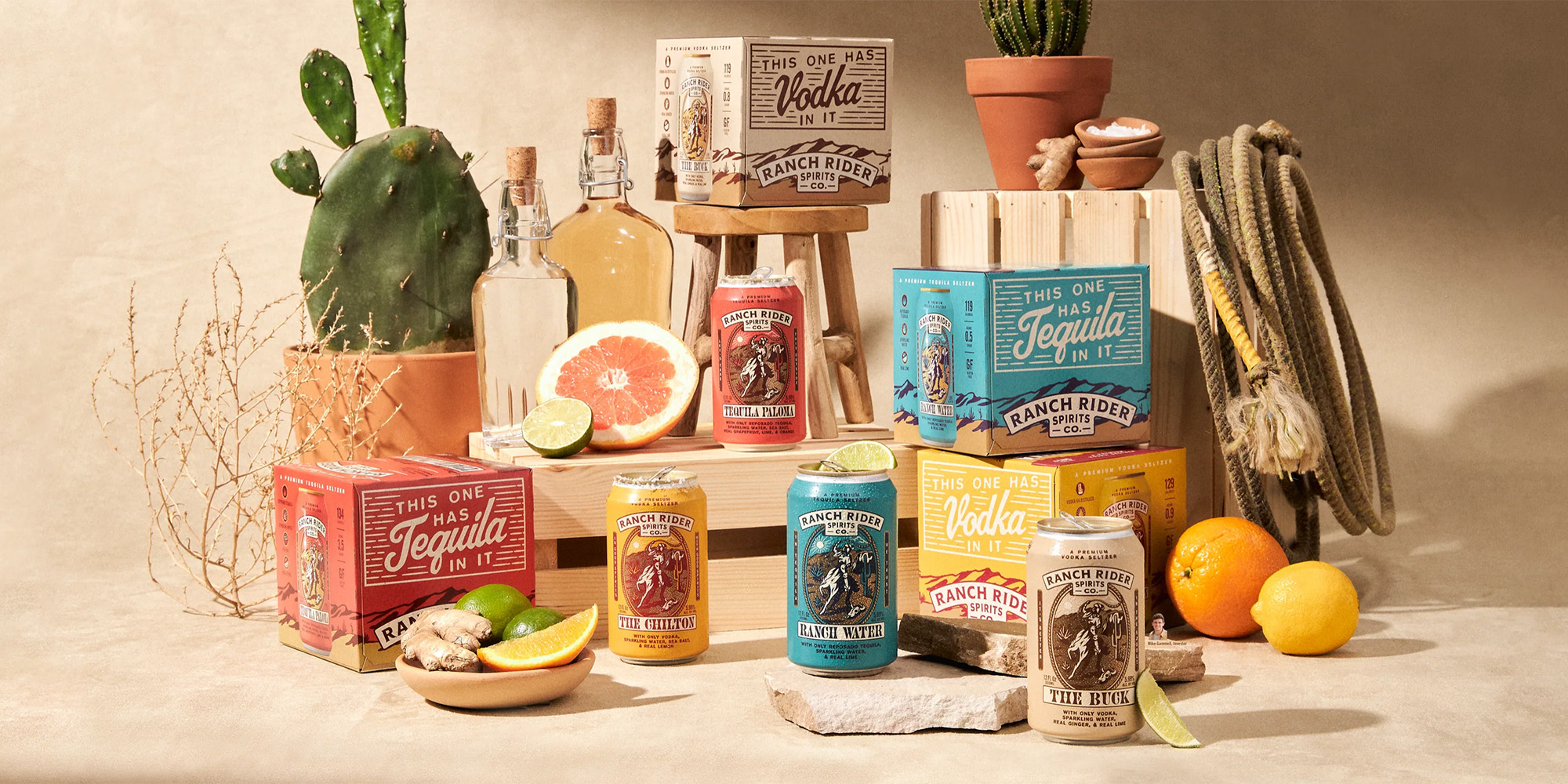
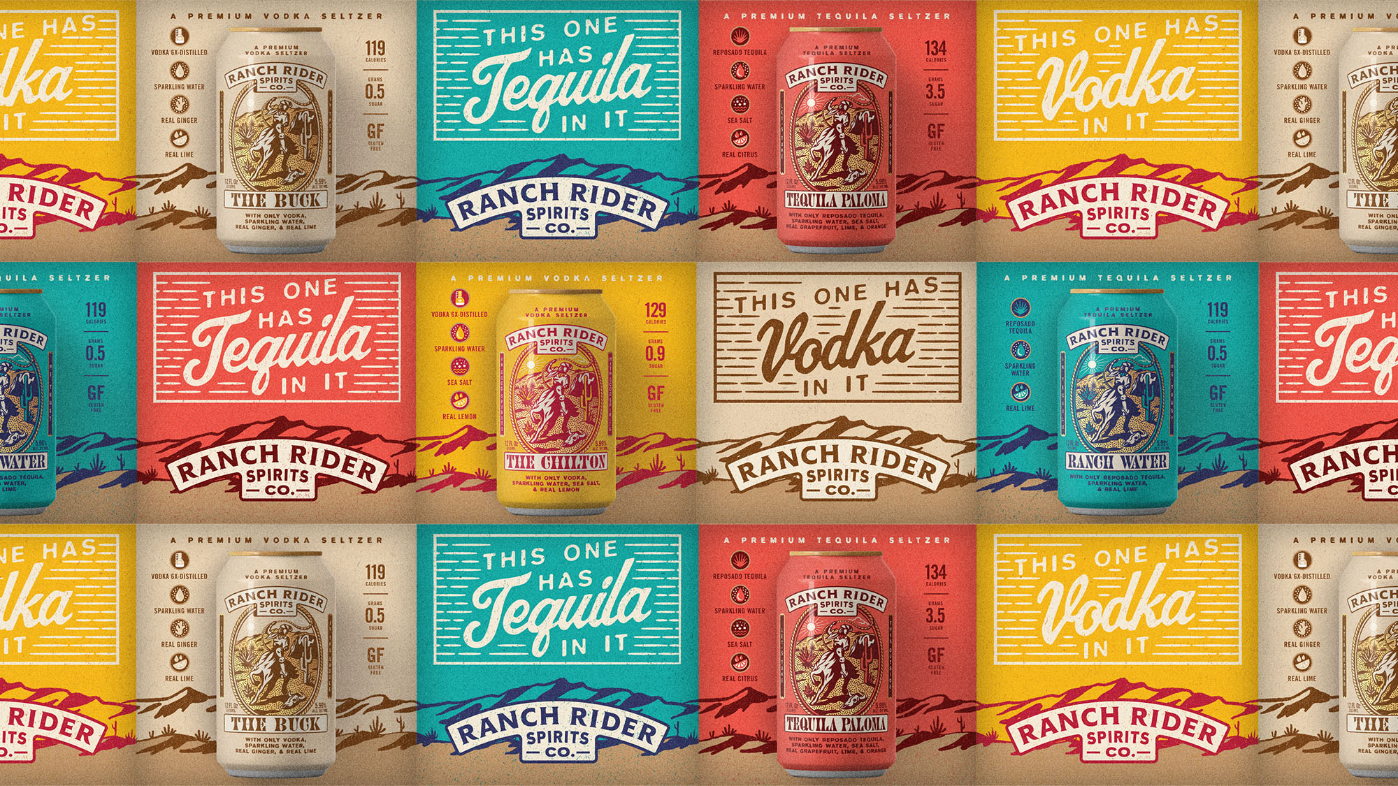
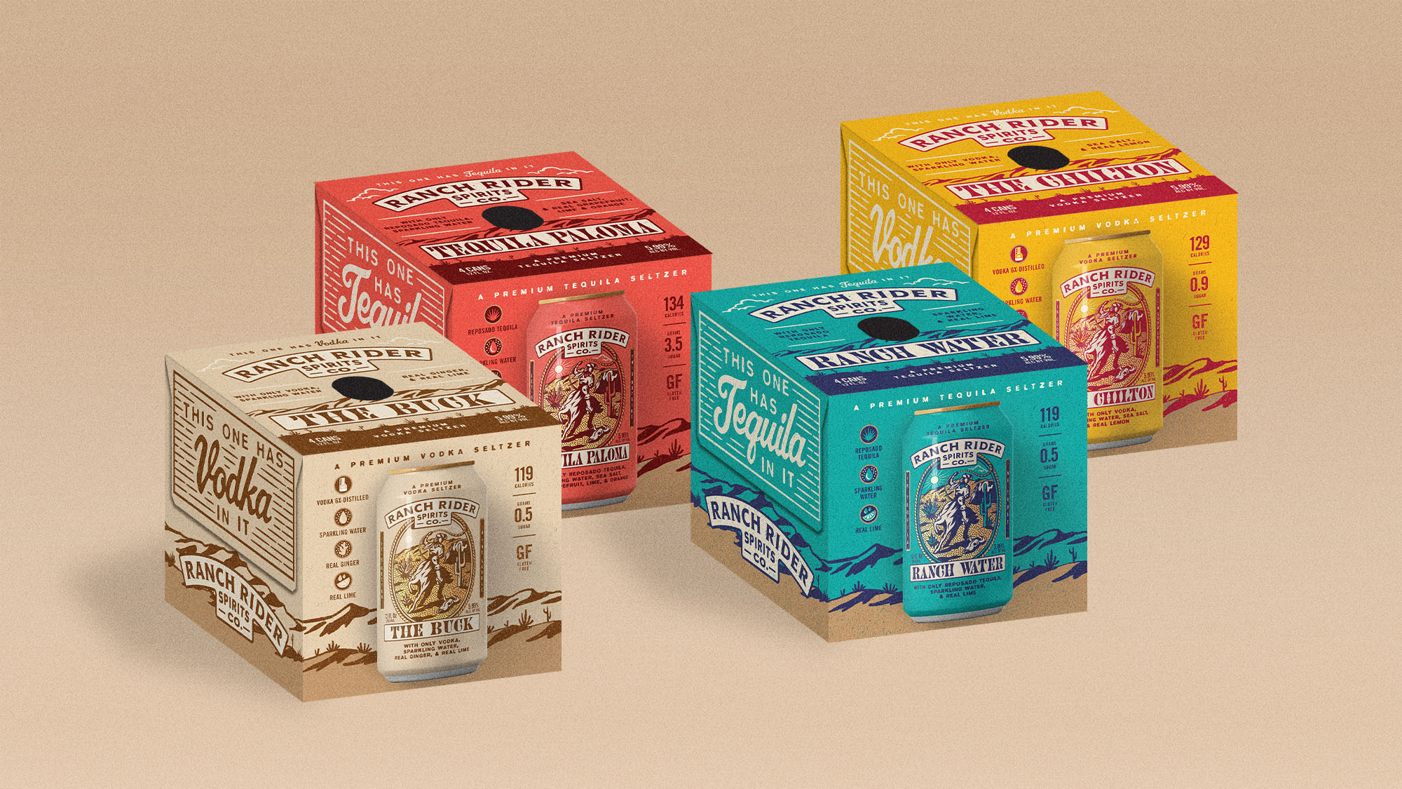
Ranch Rider Spirits Co.'s story begins in the back of a food truck on a sunny afternoon in Austin where they were the first to put the classic Texan cocktail Ranch Water in a can. It quickly took off and before long they expanded into three refreshing SKUs. The one problem? Their cans reflected the design of their food truck and didn't connect to their name. The Ranch Rider team tasked us with evolving the design of their cans and creating their first ever packaging before a national launch and the creation of new cocktails.
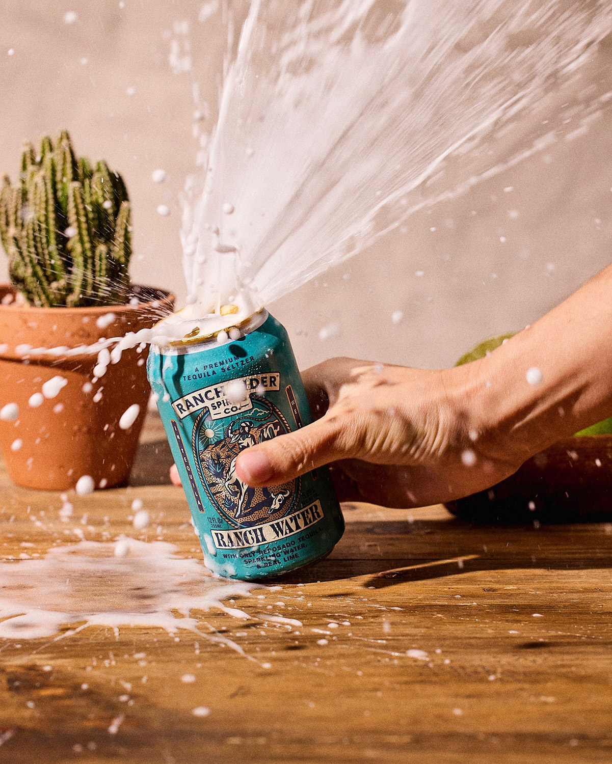
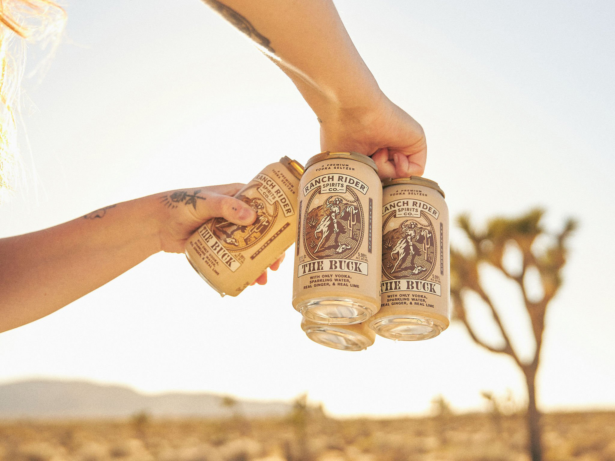
Photography by Brayden Heath.


In Good Spirits.
With Good Spirits.
No Corners Cut.
Just Limes.
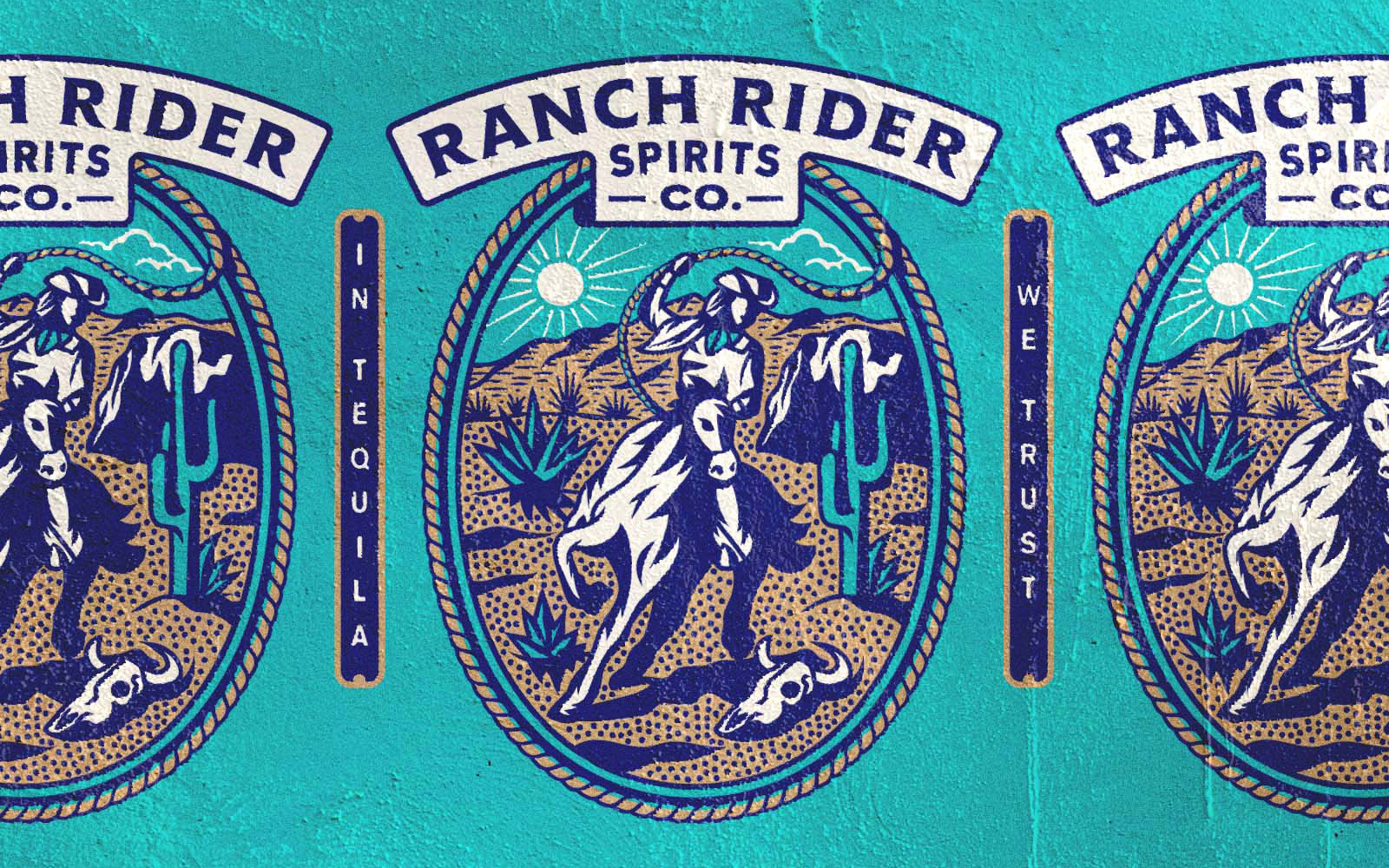
Creating movement and energy with a lassoing cowgirl and dynamic horse, we refreshed Ranch Rider's medallion in a way that is unique to the brand and category. The linework is detailed to show context yet simplistic enough to be viewed at small sizes. Our goals was to create a western vibe while still retaining a sophisticated, modern looking mark.
This One Has Tequila In It
To go with the updated can designs, we created the Ranch Rider's first packaging designs. These feature a repeating western landscape that corresponds to the colors of each flavor. To help distinguish themselves from the malty seltzers crowding shelves, we created side panels that proudly proclaim the spirit used.
Like many Texans, we were concieved in the back of a truck.

Related Work
Fruit Smash
Be Hard Seltzer Secure
Voodoo Ranger IPA
The Vootique
Previous
next
